

Work Time
(Magazine and Creative Direction)
After spending some quality “Play Time” in the first half of this year, LEAP’s Fall/Winter 2024 issue is clocking in and getting back to “Work Time.” How are the various types of labor in the art industry recognized and defined? How much invisible work often goes unnoticed? How did we arrive at the current language for defining and classifying work? And, most importantly, how do we see and support workers in vulnerable positions?
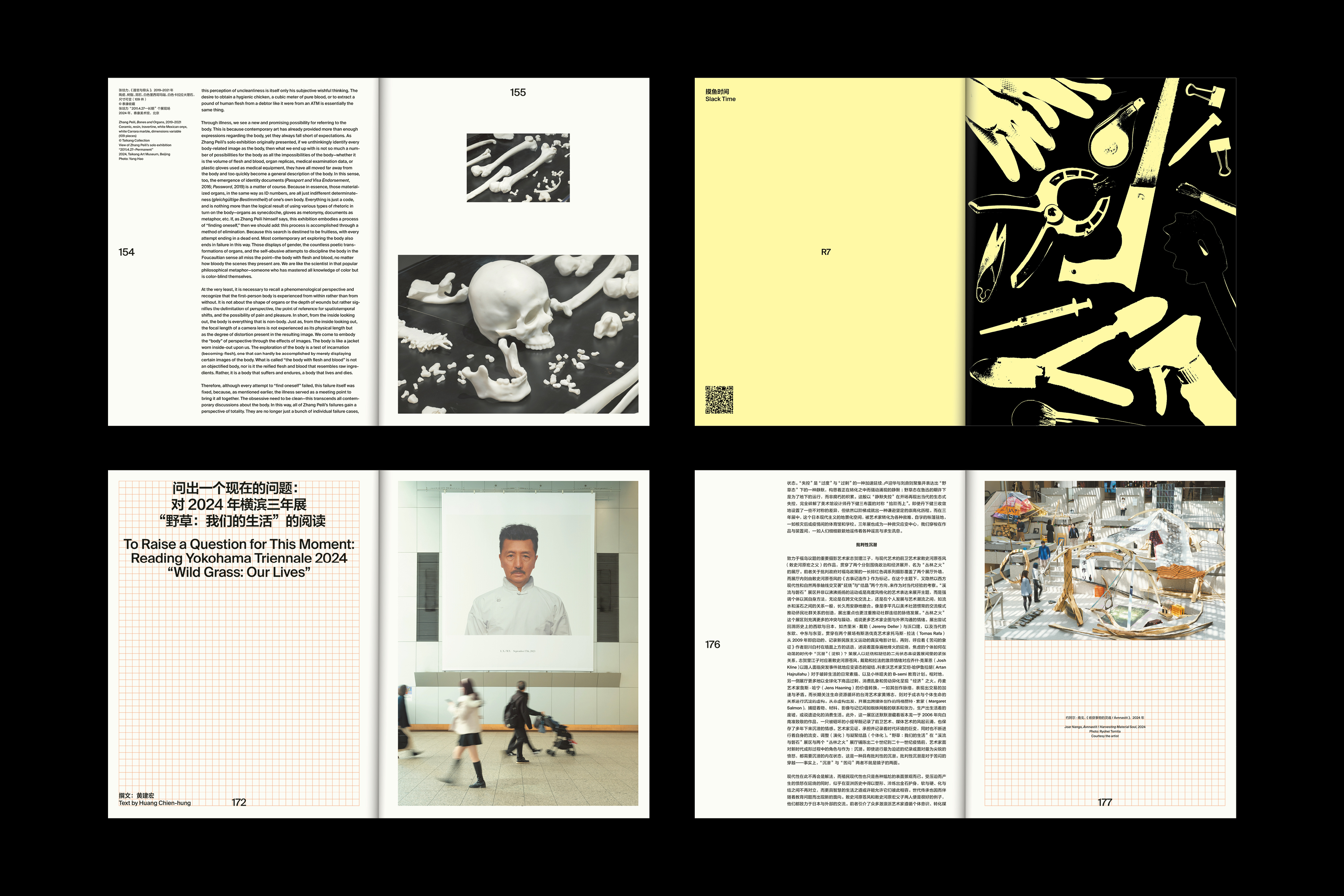
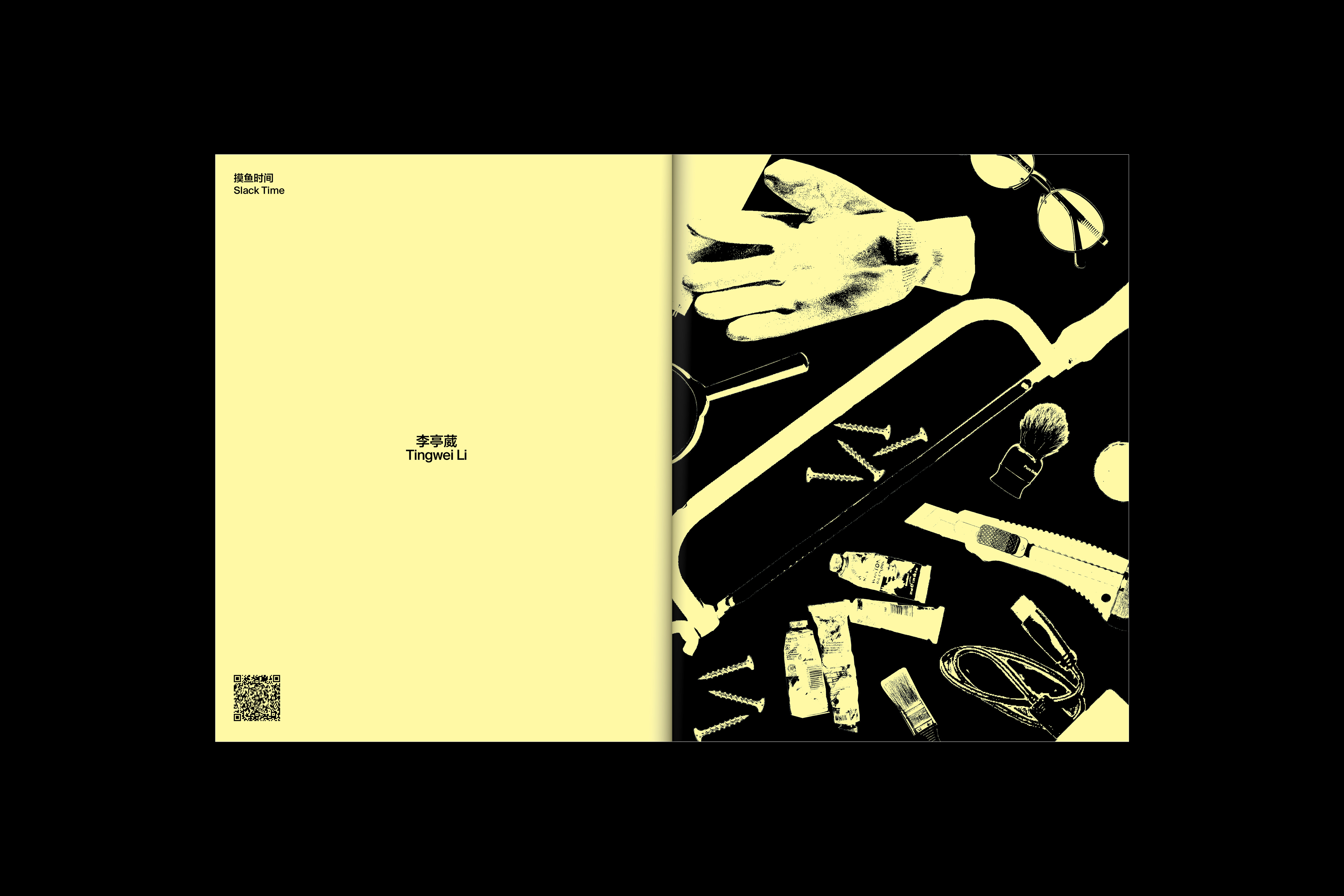
In various contexts, the yellow and black color palette is frequently used in warning signs to capture attention and alert people to potential hazards. This striking combination is employed throughout the issue to emphasize the unseen labor shaped by vastly different experiences and perceptions of work. Departing from the graphics of the “Play Time” issue, the design incorporates a rougher, more textured image treatment, drawing inspiration from street-side worker advertisements and old newspaper aesthetics. The overall design pivots around making invisible labor visible—reflecting the grittier, more tangible aspects of work.
(Magazine and Creative Direction)
After spending some quality “Play Time” in the first half of this year, LEAP’s Fall/Winter 2024 issue is clocking in and getting back to “Work Time.” How are the various types of labor in the art industry recognized and defined? How much invisible work often goes unnoticed? How did we arrive at the current language for defining and classifying work? And, most importantly, how do we see and support workers in vulnerable positions?
In various contexts, the yellow and black color palette is frequently used in warning signs to capture attention and alert people to potential hazards. This striking combination is employed throughout the issue to emphasize the unseen labor shaped by vastly different experiences and perceptions of work. Departing from the graphics of the “Play Time” issue, the design incorporates a rougher, more textured image treatment, drawing inspiration from street-side worker advertisements and old newspaper aesthetics. The overall design pivots around making invisible labor visible—reflecting the grittier, more tangible aspects of work.